Using a Three Tier Structure in Oikaze
Oikaze is designed to be flexible and work with a variety of different structures. This example shows how to use a three tier structure (Design Tokens — a Design System Superpower!, The Pyramid Design Token Structure) with Oikaze. This structure defines a base tier (referred to as ‘Global’ or ‘Primitives’ or ‘Reference Tokens’) that defines all the base values. These are then referenced by other token sets (referred to as ‘Alias’ or ‘System Tokens’) where the names are more meaningful and indicate a design decision. Finally, a third layer of ‘component Tokens’ are used to define the values for specific components.
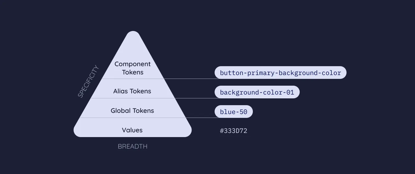
Three-tier Tokens structure Source
This structure is useful as it allows the base values to be reused in multiple contexts. For example, the color red-800 might be used as the primary color in one context and as the background color for a button in another context. In addition if the system tokens reference the base tokens by value (in Oikaze, by using a tokan prefixed with a $) then the base value defintions can be ommited from the CSS output. This is seen below where only system and system-dark-mode CSS variables are output.
Furthermore, it is possible to override only the system tokens to apply a theme to the entire design system and let CSS cascading apply the theme to components. This is demonstrated in the example by using the @media (prefers-color-scheme: dark) rule to override the system tokens with the system-dark-mode theme.
// _global-colors.scss
$red-50: #ff593a;
$red-60: #a1170a;

$blue-50: #4557b6;
$blue-60: #2a4ff0;

$black: #000000;
$white: #ffffff;
// _button-component.scss
$primary-background: '{color.primary}';
$primary-text: '{color.foreground}';

$secondary-background: '{color.secondary}';
$secondary-text: '{color.foreground}';
// _index.scss
@use 'sass:meta';

@use './global-colors.scss' as global-colors;
@use './button-component.scss' as button-component;

@forward 'oikaze' with (
  $default: 'system',
  $sets: (
    primitive: (
      color: meta.module-variables(global-colors),
    ),
    system: (
      color: (
        primary: '{primitive:$color.blue-60}',
        secondary: '{primitive:$color.red-50}',
        foreground: '{primitive:$color.black}',
        background: '{primitive:$color.white}',
      ),
    ),
    system-dark-mode: (
      color: (
        primary: '{primitive:$color.blue-50}',
        secondary: '{primitive:$color.red-60}',
        foreground: '{primitive:$color.white}',
        background: '{primitive:$color.black}',
      ),
    ),
    component: (
      button: meta.module-variables(button-component),
    ),
  )
);
// style.scss
@use 'tokens' as tokens;

:root {
  @include tokens.css-definitions();
}

body {
  color: tokens.get('color.foreground');
  background-color: tokens.get('color.background');

  &.invert {
    @include tokens.css-definitions('system-dark-mode');
  }
}

@media (prefers-color-scheme: dark) {
  :root {
    @include tokens.css-definitions('system-dark-mode');
  }

  body {
    &.invert {
      @include tokens.css-definitions();
    }
  }
}

@include tokens.scope('component') {
  .btn {
    @include tokens.css-definitions();

    &--primary {
      background-color: tokens.get('button.primary-background');
      color: tokens.get('button.primary-text');
    }

    &--secondary {
      background-color: tokens.get('button.secondary-background');
      color: tokens.get('button.secondary-text');
    }
  }
}
// style.css
:root {
  --color-primary: #2a4ff0;
  --color-secondary: #ff593a;
  --color-foreground: #000000;
  --color-background: #ffffff;
}

body {
  color: var(--color-foreground, #000000);
  background-color: var(--color-background, #ffffff);
}
body.invert {
  --color-primary: #4557b6;
  --color-secondary: #a1170a;
  --color-foreground: #ffffff;
  --color-background: #000000;
}

@media (prefers-color-scheme: dark) {
  :root {
    --color-primary: #4557b6;
    --color-secondary: #a1170a;
    --color-foreground: #ffffff;
    --color-background: #000000;
  }
  body.invert {
    --color-primary: #2a4ff0;
    --color-secondary: #ff593a;
    --color-foreground: #000000;
    --color-background: #ffffff;
  }
}
.btn {
  --button-primary-background: var(--color-primary, #2a4ff0);
  --button-primary-text: var(--color-foreground, #000000);
  --button-secondary-background: var(--color-secondary, #ff593a);
  --button-secondary-text: var(--color-foreground, #000000);
}
.btn--primary {
  background-color: var(--button-primary-background, #2a4ff0);
  color: var(--button-primary-text, #000000);
}
.btn--secondary {
  background-color: var(--button-secondary-background, #ff593a);
  color: var(--button-secondary-text, #000000);
}